

Simplifying Business Onboarding for
UAE & KSA
Role:
Product designer
Duration:
3 months
Year:
2024
Collaborators: Design lead, Product owner, Tech team, Data analytics
Minor enhancements
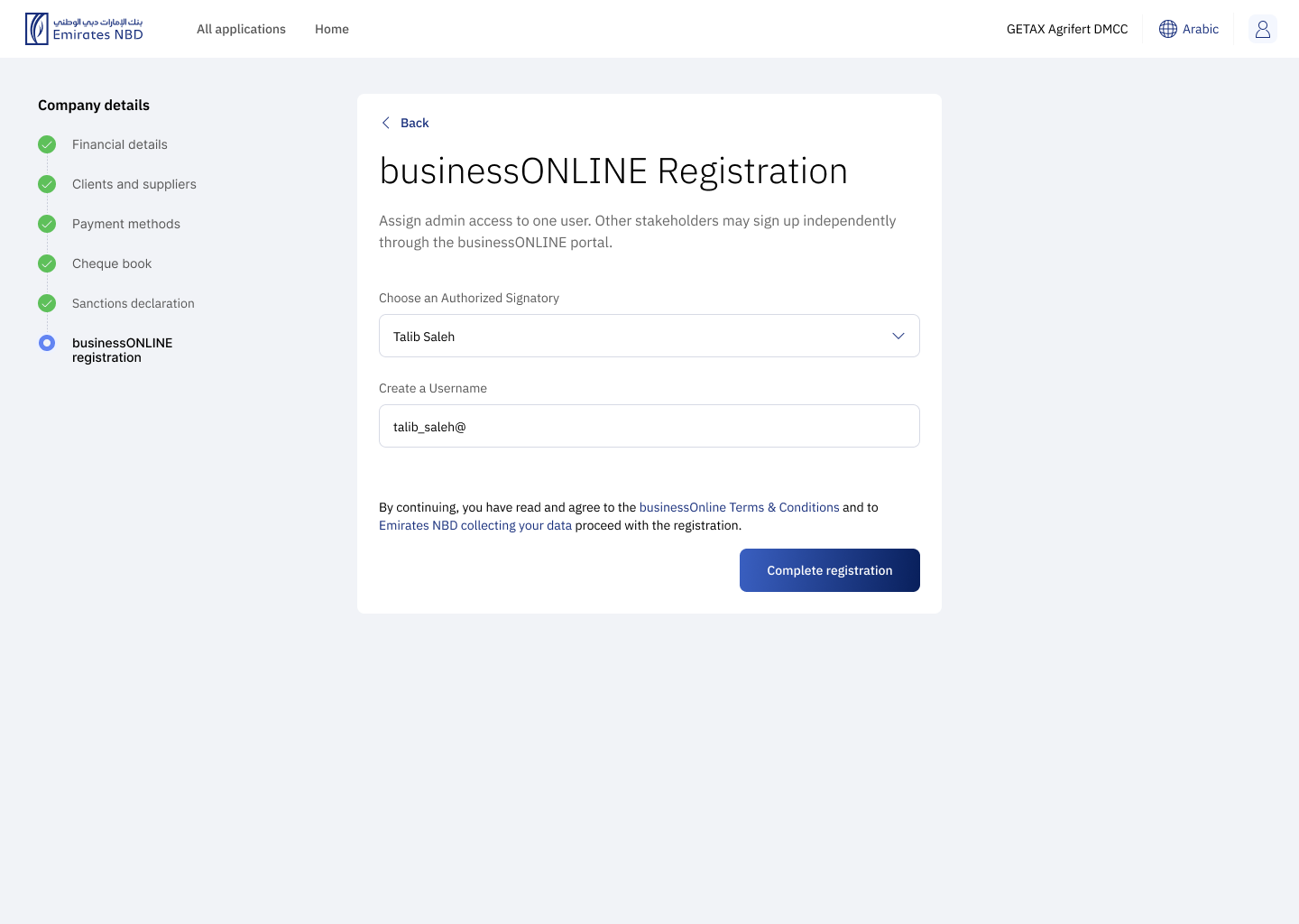
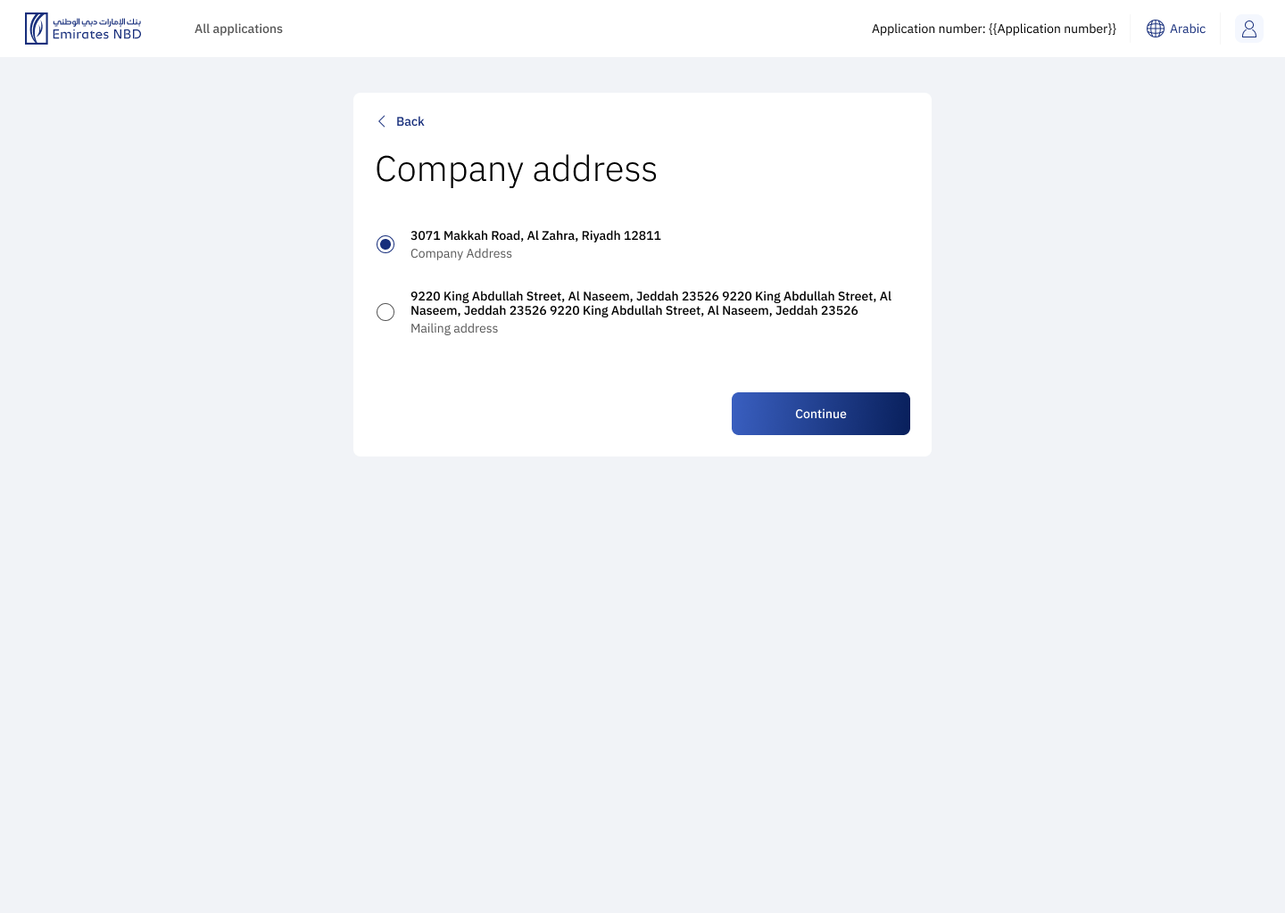
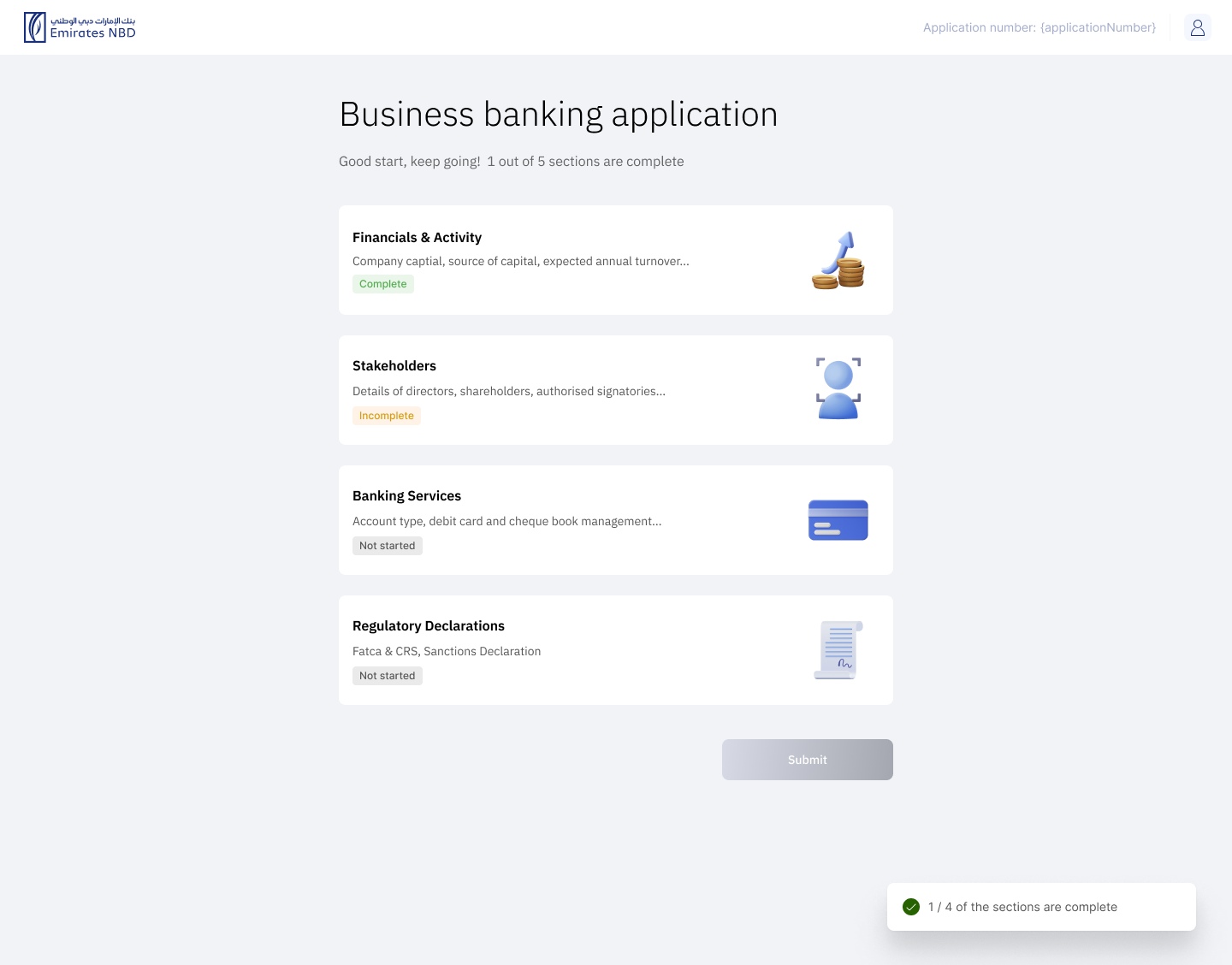
Application screen
The previous design was not optimized for mobile screens and lacked scalability for future needs. The "Required Documents" section was visually distracting due to its locked state, which confused users as they couldn't access it until later in the process.
The updated UI features improvements in design, accessibility, and scalability. Key changes include:
Clear Status Indicators: I redesigned the cards to clearly indicate their status, helping users easily track their progress.
Encouragement Message: I added a supportive message below the screen title to motivate users to complete their applications. This was necessary because some users struggled with this screen and never finished the application process.
Accessibility Considerations: I ensured that text was accompanied by illustrations, particularly when using colors like green and red together, to enhance accessibility and understanding for all users.
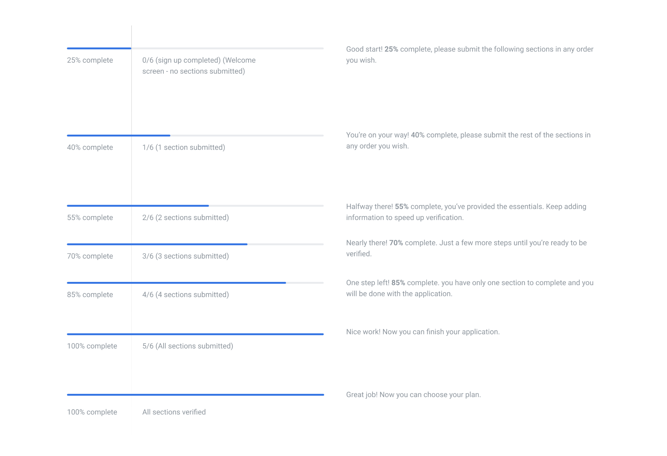
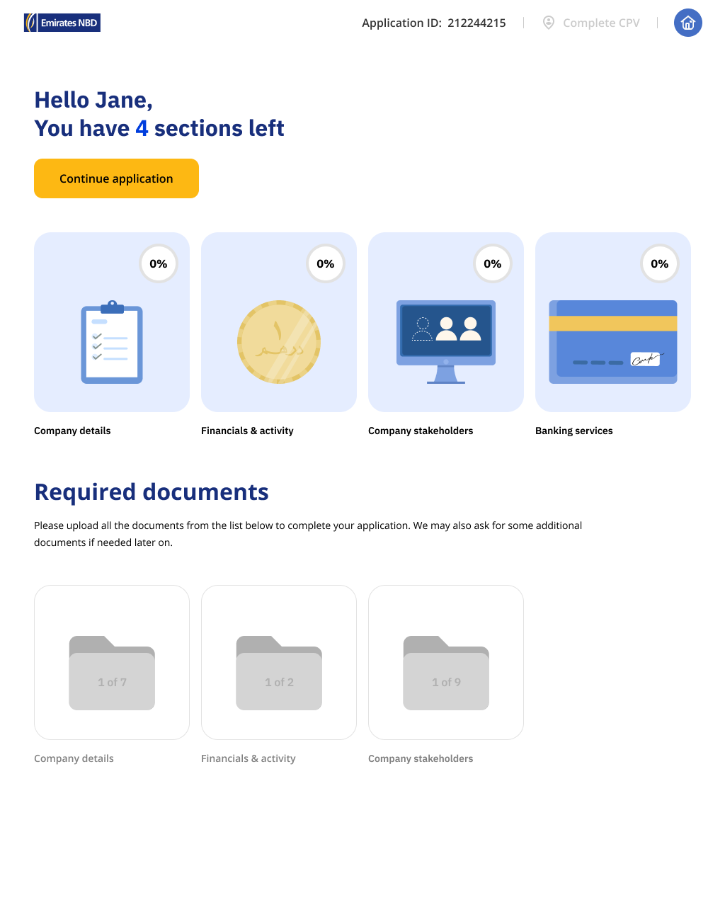
Encouragement messages during the application
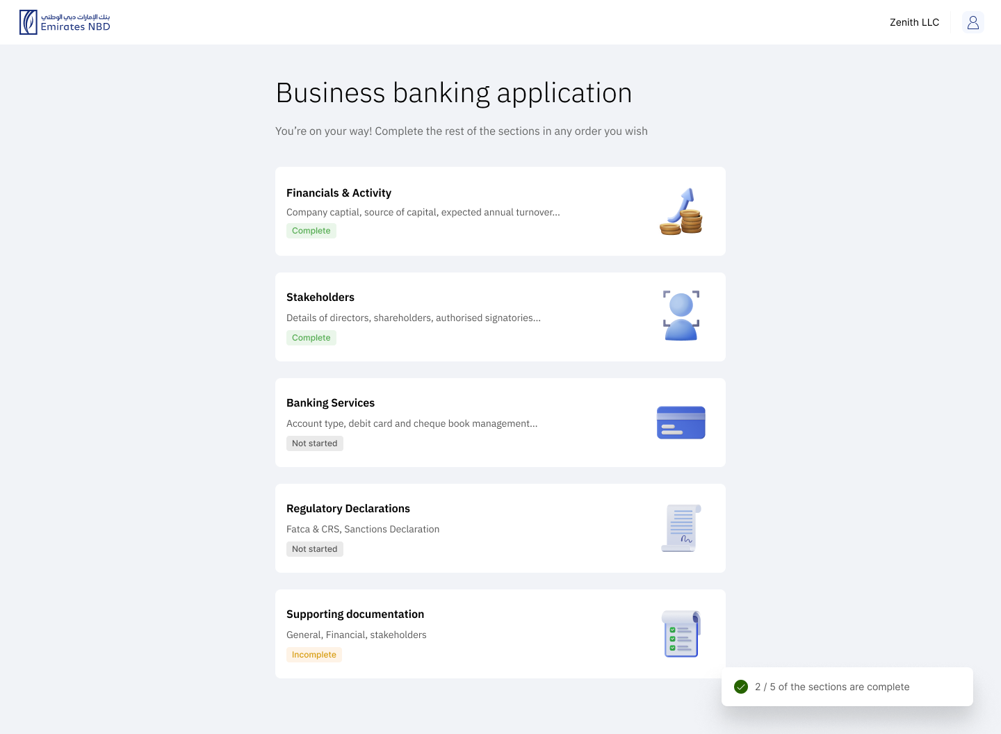
Business owners or
Shareholders screen
The previous design was not optimized for mobile screens and lacked scalability for future needs, some points are:
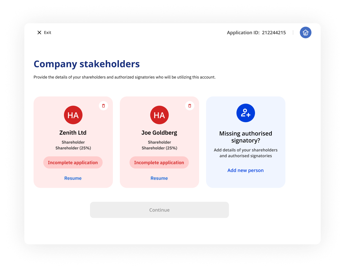
Lack of Clarity: "Incomplete application" in red may confuse and discourage users.
Color and Icon Usage:Red color alarms users; "Resume" button lacks contrast.
Guidance for Missing Info: "Missing authorised signatory?" lacks clear instructions.
Accessibility: Contrast and readability may not meet accessibility standards.
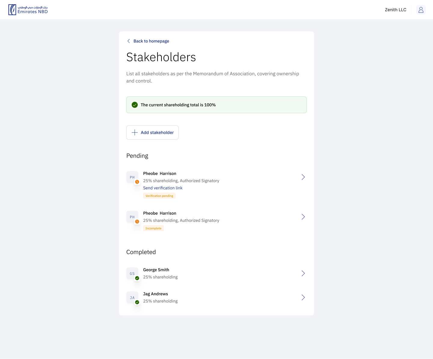
While reskinning, I made sure to improve the existing screens and make sure that the screens are easy and intuitive to use. I also made sure to test extreme cases on both platforms.
Conclusion
email me on ux.mehek@gmail.com


Simplifying Business Onboarding for
UAE & KSA
Role:
Product designer
Duration:
3 months
Year:
2024
Collaborators: Design lead, Product owner, Tech team, Data analytics
Minor enhancements
Application screen
The previous design was not optimized for mobile screens and lacked scalability for future needs. The "Required Documents" section was visually distracting due to its locked state, which confused users as they couldn't access it until later in the process.
The updated UI features improvements in design, accessibility, and scalability. Key changes include:
Clear Status Indicators: I redesigned the cards to clearly indicate their status, helping users easily track their progress.
Encouragement Message: I added a supportive message below the screen title to motivate users to complete their applications. This was necessary because some users struggled with this screen and never finished the application process.
Accessibility Considerations: I ensured that text was accompanied by illustrations, particularly when using colors like green and red together, to enhance accessibility and understanding for all users.
Encouragement messages during the application
Business owners or
Shareholders screen
The previous design was not optimized for mobile screens and lacked scalability for future needs, some points are:
Lack of Clarity: "Incomplete application" in red may confuse and discourage users.
Color and Icon Usage:Red color alarms users; "Resume" button lacks contrast.
Guidance for Missing Info: "Missing authorised signatory?" lacks clear instructions.
Accessibility: Contrast and readability may not meet accessibility standards.
While reskinning, I made sure to improve the existing screens and make sure that the screens are easy and intuitive to use. I also made sure to test extreme cases on both platforms.
Conclusion
email me on ux.mehek@gmail.com